


Color trends 2027 this reflects a shift in modern design thinking, where color not only creates aesthetic accents but also contributes to shaping emotions and connecting people with their living spaces.
According to the trend forecast report from WGSN The Spring-Summer 2027 color palette is shaped by this spirit of interconnectedness. This is the intersection of natural beauty, a sense of peace, and positive energy from AI technology and the digital world.
Let’s take a look at the Hoa Giang 5 main colors of 2027 is predicted to lead trends in fashion, architecture, and interior design globally.
Nội dung chính
- 1 1. Luminous Blue – The luminous blue of the digital age
- 2 2. Energy Orange – Orange tones to restore energy and boost morale.
- 3 3. Pop Pink – A shade of pink that is free, unrestrained, and vibrant.
- 4 4. Meadowland Green – A healing remedy from natural meadows.
- 5 5. Clay – Neutral earth tones & balanced texture
- 6 Hoa Giang offers cutting-edge decorative stainless steel material solutions.
- 7 Conclude
1. Luminous Blue – The luminous blue of the digital age
Being named as Color of the Year 2027, Luminous Blue It possesses a vibrant blue tone with a subtle luminescence. This color is considered a bridge connecting two worlds: the meticulousness of traditional craftsmanship and the infinite depth of the digital space. Luminous Blue It instills confidence, stimulates innovative thinking, and represents a pioneering spirit.
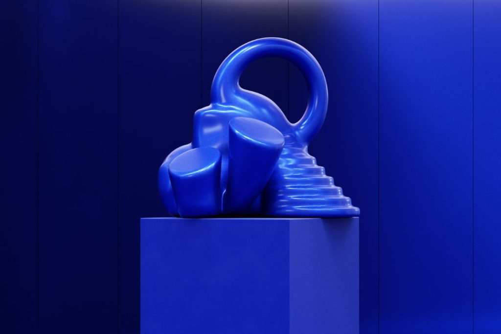
Luminous Blue boasts a striking blue color.
– Space applications: This color palette is perfectly suited for creating visual accents in hotel lobbies, technology showrooms, high-end fashion boutiques, or decorative wall sections in creative offices.
– Material interactions: This modern shade of blue will flourish best when combined with reflective metallic surfaces. The appearance of PVD-coated stainless steel the blue or polished stainless steel finish allows light to spread in multiple directions, creating a visual effect that is both luxurious and futuristic.
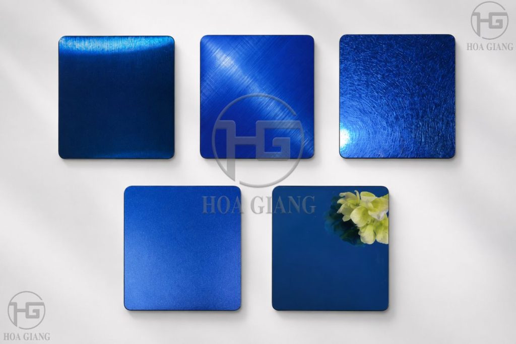
Hoa Giang presents a collection of blue-plated stainless steel, leading the trend.
2. Energy Orange – Orange tones to restore energy and boost morale.
It doesn’t feel overly flashy or ostentatious. Energy Orange It’s a warm, rich, and vibrant shade of orange. This color palette is likened to a source of renewable energy, representing resilience and optimistic belief in the face of change. In interior design, this orange hue has the ability to stimulate the senses, dispel coldness, and promote connection between people.
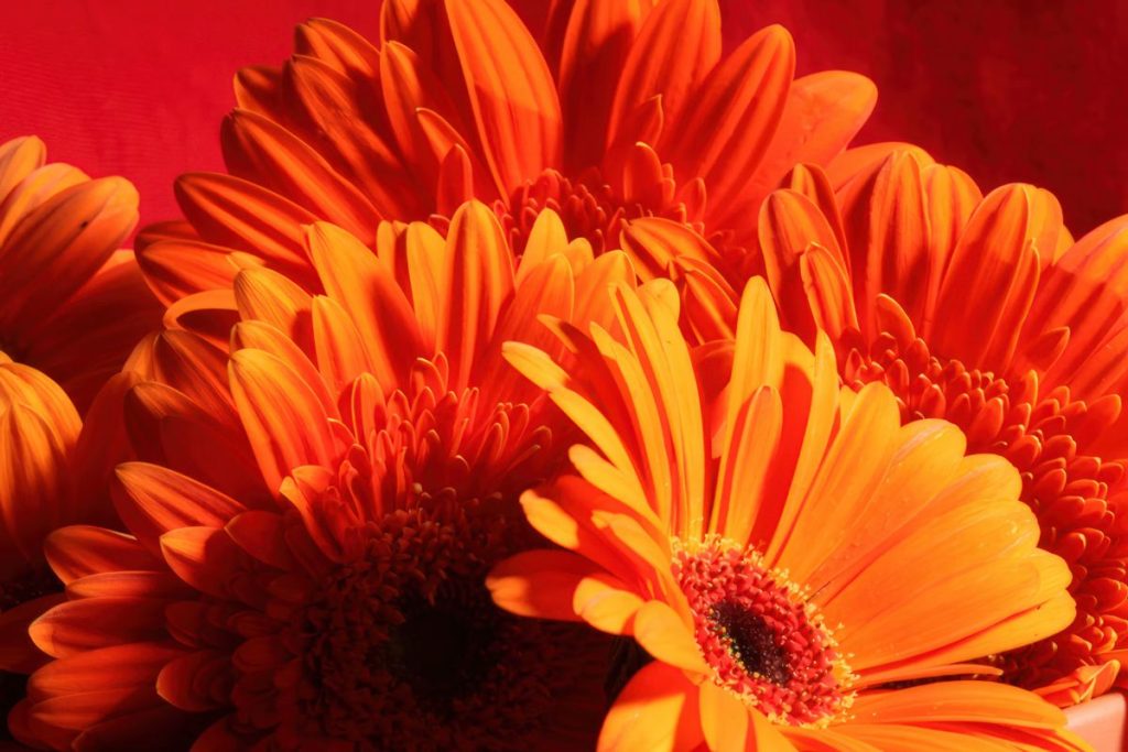
Energy Orange stimulates and invigorates the visual senses.
– Space applications: Ideal for high-interaction commercial spaces such as restaurants, cafes, office pantry areas, or common living spaces in homes.
– Material interactions: To make the orange color stand out while maintaining sophistication, shaping the architectural lines is crucial. Designers often use sharp stainless steel trim. The contrast between the warmth of the orange and the other colors creates a striking effect. Energy Orange and the slenderness of the metal material will create a very coherent and modern spatial structure.
3. Pop Pink – A shade of pink that is free, unrestrained, and vibrant.
Pop Pink represents the spirit of “unserious fun”– a lifestyle that emphasizes stress relief, natural joy, and the freedom to express individuality. This vibrant, pop-culture-inspired pink tone brings a dynamic new energy, breaking free from the rigidity and dryness often found in restrictive minimalist design styles.
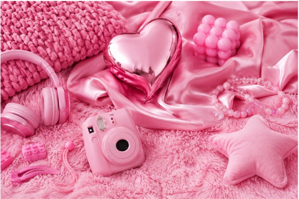
Pop pink brings a youthful and fresh look.
– Space applications: Often favored in the design of cosmetic stores and flagship stores, it serves as a focal point for unique furniture pieces such as armchairs, rugs, or decorative lamps.
– Material interactions: To avoid appearing too flashy, Pop Pink Often “refined” and elevated by being paired with premium metal surfaces. Surfaces Hand-polished stainless steel with hairline finish Alternatively, PVD-coated stainless steel in champagne pink with fine, striped brushed textures will soften the intensity of the pink, creating an incredibly charming and fashionable aesthetic.
4. Meadowland Green – A healing remedy from natural meadows.
Focus entirely on stillness and inner renewal Meadowland Green It’s a rustic green tone, inspired by natural branches and grass under the sun. This color acts as a spiritual balm, leading people away from urban pressures to rediscover peace and connect with nature.
– Space applications: Perfect for nature-inspired architectural projects, spa spaces, resort areas, yoga studios, or family bedrooms where maximum relaxation is prioritized.
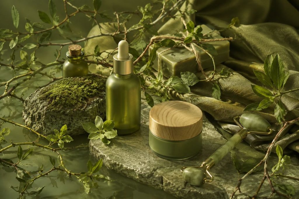
Meadowland Green has a rustic green tone.
– Material interactions: Meadowland Green It blends perfectly with natural materials such as wood, rough stone, and warm-toned metals. When combined with matte gold-plated stainless steel trim strips, the soft metallic sheen acts like dappled sunlight, making the overall green space warm, harmonious, and full of depth.
5. Clay – Neutral earth tones & balanced texture
The appearance of Clay – Neutral, rustic terracotta tones serve as the grounding for the entire top color trends of 2027. Amidst a fast-paced technological world, terracotta colors offer a sense of security, authenticity, and evoke enduring, fundamental values.
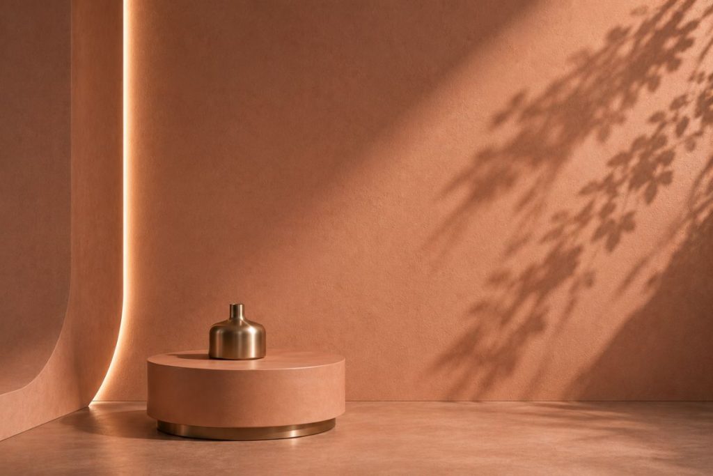
Clay features neutral, warm tones.
– Space applications: This is a great background color for Minimalist architecture, Wabi-Sabi style, vacation villas, or art galleries.
>> Let’s take a look at the latest interior design trends
– Material interactions: Because of Clay With its understated character and raw materials, architects often proactively create subtle contrasts by adding accent details made of PVD-coated stainless steel with a high degree of smoothness. The pairing of the rustic surface of earthen/concrete walls and the bright, polished finish of decorative stainless steel creates a luxurious and sophisticated aesthetic.
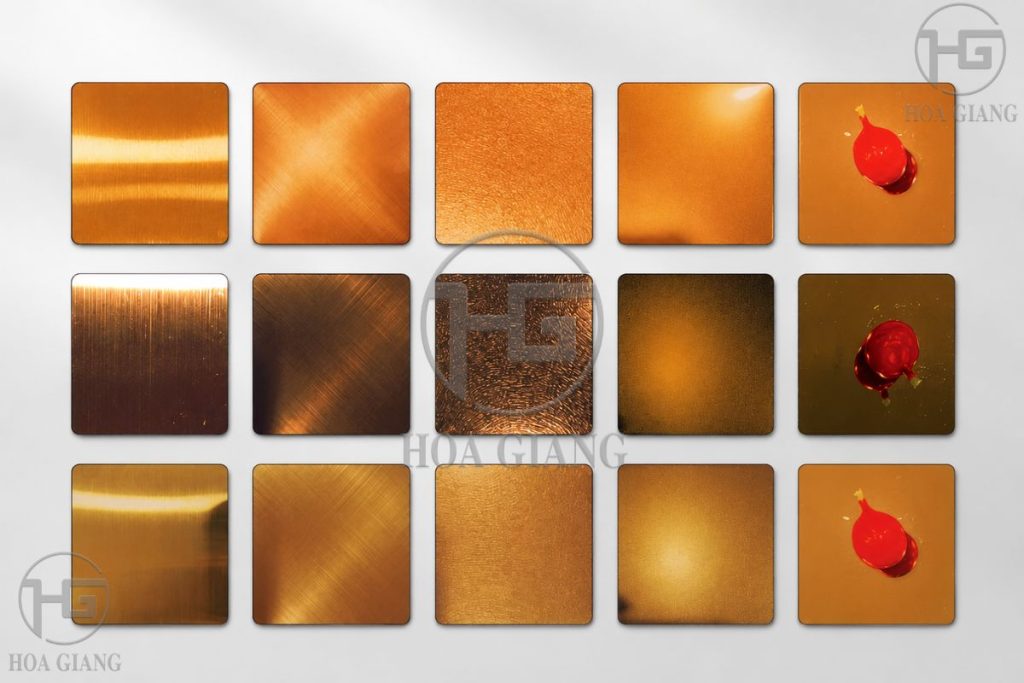
Hoa Giang offers a diverse collection of colorful materials.
Hoa Giang offers cutting-edge decorative stainless steel material solutions.
An excellent color scheme on a technical drawing can only be brought to life in reality when accompanied by the right finishing materials. Whether the colors are accurate and the space achieves the desired level of perfection depends greatly on the surface of the processed material.
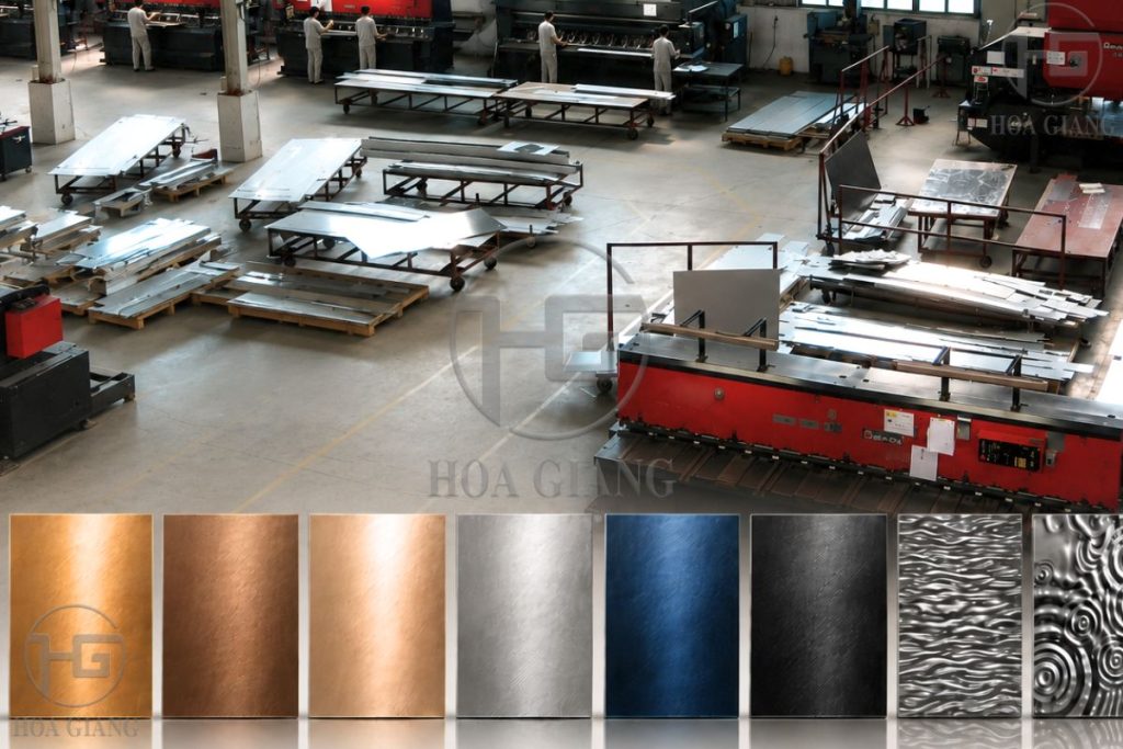
Hoa Giang owns a large-scale factory, supplying a wide variety of materials.
With a pioneering position and a journey nearly 20 years of development within the industry, we have the same capabilities in processing and installing high-end decorative stainless steel in Vietnam. Hoa Giang are proud to be a strategic partner of many architects, contractors, and investors in large-scale projects:
– Modern processing technology: Hoa Giang utilizes a synchronized advanced PVD vacuum plating line, a precise laser cutting system, and meticulous hairline polishing techniques. As a result, its decorative stainless steel products always ensure optimal smoothness, consistent color, and superior colorfastness over time.
– Bringing every design idea to life: Whether your project requires a modern reflective effect or not Luminous Blue or the gentle, simple charm that enhances the colors Clay Hoa Giang is always ready to provide a diverse range of surface materials to turn any trending 2027 color palette idea into reality.
Conclude
Color trends 2027 palette not only offers fresh visual predictions but also opens up endless creative possibilities for the architecture and interior design industries.
Understanding the emotional story behind each color, combined with skillful use of modern decorative stainless steel materials, is the key for designers to create projects that are both trend-setting and enduring.
If you need advice and assistance in choosing decorative stainless steel materials that match the 2027 color trends, contact Hoa Giang today for prompt and professional support.
HOA GIANG STAINLESS STEEL
Fanpage: Hoa Giang Stainless Steel Group
Hotline: Ms. Diem 0918311491 – Mr. Khang 0949805203


